Multi-Millionaire’s
Presentation Design Tricks
You Can Exploit For Profit
Hi, Dennis Becker here and if you’re creating presentations to persuade, sell, educate, or in any other capacity… I believe this can put a lot of money in your pocket directly or indirectly with only a handful of simple changes and tweaks to what you’re already doing.
That’s a bold promise, I know. So let’s get started and let’s examine what I have for you here today.
No matter what you’re creating presentations for – sales, education, work projects…
… There are two ways to go about doing that!
One way is to just wing it. Which is what most people do. They watch a free video on Youtube, maybe flip through a “For Dummies” book and start putting together their presentation. After all, both Keynote and Powerpoint are simple enough to figure out.
The problem is unless you’re naturally talented (and there are people like that!) your presentations will look not that great. The real problem though is that they won’t get results.
Sales will fall flat, people won’t understand what you’re teaching, your boss won’t get your brilliant idea about improving the product manufacturing process (and you won’t get a promotion…) – you get the picture.
Other option…
The other option is to spend a lot of time really digging deep into design. Typography. The technical aspects of making a pleasant design.
That takes not weeks. Not months. If you want to master something… it’s been said you need to spend 10,000 hours on it. That’s 1 year and 1 month… if you never sleep. It’s closer to 4 years if you want to sleep and eat.
… So this is clearly not an option either for busy people who need results right away so that they can sell, persuade and educate tonight.
Which Is Why You’re Going To Love This!
There’s a much, much, MUCH better way to approach this than to just wing it – or spend years mastering presentation design.
What if there was a handful of shortcuts I could give you that you could use to…
- Make your presentations stand out (in the right way) and help you achieve your goals – sales, education, brand building, persuasion… and much much more
- Quickly give your presentations an extra punch without bogging you down with technical details by applying specific, proven design tricks…
- Most importantly, get amazing results as soon as tonight
Even better… these presentation design shortcuts have been proven with millions of dollars of revenue online – specifically, $32,895,819 dollars over just a few short years.
The $32,895,819 Touch…
Meet Jason Fladlien. What he has accomplished over the course of just a few short years is nothing short of amazing. To date, his company Rapid Crush, Inc. has generated well over $32 million dollars online.
There are two reasons why that’s important for us right here, right now.
First, he achieved these results using his skills as a presenter. Jason designs his own presentations and then masterfully presents them… both for persuasion & sales, as well as education.
Second… when we’re talking that kind of money, it doesn’t happen doing things the way everyone else is doing. Jason has a lot of shortcuts when it comes to design process… and you can bet your bottom dollar that every design trick Jason is using has been proven through millions of dollars in sales – or has been presented in front of tens of thousands of students.
You’re Getting His Best Shortcuts
… Or as I like to say, you’re getting the little hinges that swing the big doors.
What you’re about to learn isn’t Keynote or Powerpoint basics. Instead, you’re getting presentation design tricks that will let you…
Shortcut the learning curve and create presentations that look much better than your competition’s… even if you’re “technically challenged”. You’ll be able to persuade better, teach better, sell more… all that good stuff.
I’m excited to introduce…
Slide Envy is an ‘a la carte’ video course. What I mean by that is that once you’re inside, just click on a video that intrigues you, watch it – and immediately use it for your presentation.
… Then, come back and do it again if you feel like it. Click, discover, use. And again. This way, you’re going to be able to improve your presentations dramatically over a very short period of time without any overwhelm.
Here’s what you’re going to discover…
- The step by step system to building slides that communicate, educate & sell… including the most important trick to choosing fonts, how to pick a bullet image (and avoid those ugly built-in bullets), where to get images for free or for very little money and more
- How to give your presentation a very subtle but important advantage over your competition by changing one thing most people don’t consciously notice…
- How to create really cool title slide with no design knowledge at all – and more importantly, without relying on tired templates & clipart that just bore your viewers
- How to use the “isolation effect” to draw attention to a particular area on a slide… and how to leverage this effect for maximum conversions
Let’s talk about some of this.
For example… how would a title slide look if you built it using the techniques you’re about to discover? Here’s what Jason will create right in front of your eyes, step by step, inside the course. And it takes just minutes!
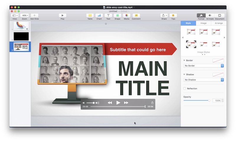
Pretty awesome, right?
Another thing I’d like to highlight is the isolation effect. Because once you do understand the power of this… you’re going to want to use it in almost every presentation you create. Why? I’m going to tell you that in a second. Let’s take a look at how it would look in your presentation.
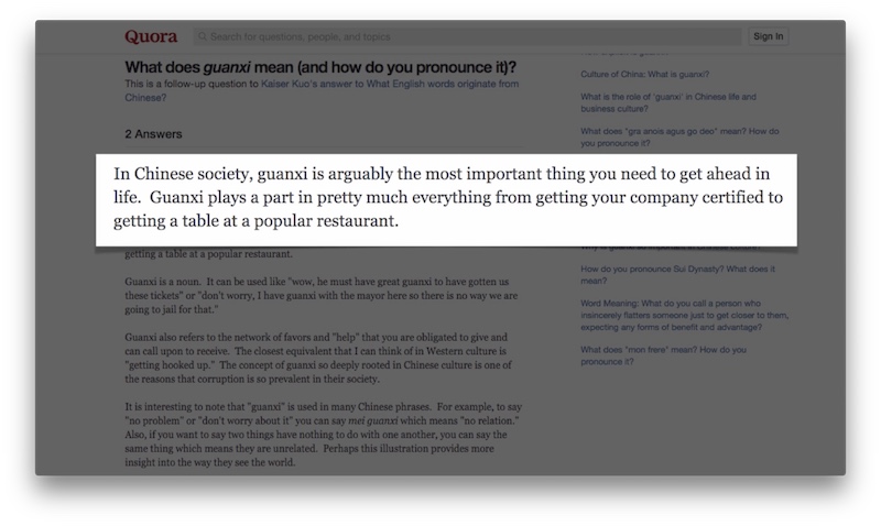
So how can you use it to maximize conversions? One way is to use it to demonstrate proof from 3rd party sites – like statistics, statements, etc. This way, you can borrow credibility without sacrificing readability (which is what most people do by including a simple screenshot of the entire page).
… And that’s just one idea. I’m sure you’ll have plenty more when you start including this technique in your presentations.
That’s not it…
We’re just getting started! You’re also going to discover things like…
- How to create web-based slides (which sounds a lot easier than it actually is… unless you do it the way Jason will show you!) and how to add meaningful animations to this type of content
- How to create a slide that makes your major point stand out in the flow of your presentation (this is BIG if you’re selling with your presentation or explaining complicated concepts to your customers)
- A trick to seamlessly connect text-based information slides that doesn’t interrupt your flow… and lets you get your point across much clearer
- What slide Jason uses on almost every single one of his pitch presentations and how to build it, step by step, for your own use without making blunders that most people do
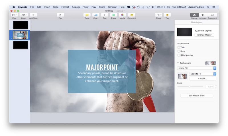
This is just one variation of how your major point slide would look like. Now would you agree that something like this would re-capture your audience’s attention and re-energize them? You bet! And it’s insanely easy to create.
Or, take the web-based slide below. A great way to showcase your websites… demonstrate supporting opinions by recognized authorities… and more.
You can probably see by now that you’re getting techniques that not only make your presentations look slicker and better… but also improve their potential to persuade, to educate, to engage… and more. But that’s not it.
There’s more!
There’s a lot more techniques and tricks you can look forward to. Such as…
- The shortcut to building extra-nice looking slides… (and when is the right time to use them)
- A really clever way to tie a point down or build a point up using something called a “partial circle shot”… and the simple shortcut that makes this “advanced” design technique almost laughably easy
- How to visually explain step by step processes (or most important factors about something, etc.)…
- More neat tricks – like animation, breaking out ideas in separate slides, how to create browser frames for images, how to even do forms with Keynote… and more!
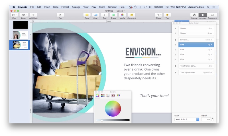
Let’s talk about a couple of these. For example, you could use the partial circle shot (below) for your title slide. However, the possibilities go beyond that. It works great for your bullets, it’s an awesome idea breakout slide, quote slide… and more.
You’ll also discover how to create forms with presentation software. Now, you might ask… clearly, Keynote (or Powerpoint) aren’t intended to do that – why would you go against the grain and still create a form using them?
Well, look at this.
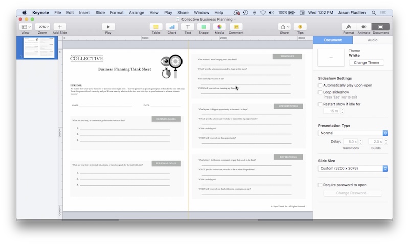
It might be a little hard to see with the web image size restrictions, but that thing is slick. And the thing is… it’s often easier to create a form like this in Keynote or Powerpoint than it is to do that in dedicated software like Adobe Indesign or Acrobat!
Putting It All Together
Plus, you’re also getting a video where Jason goes through an entire presentation and explains how the key slides were created… how the transition and in-slide animations were done… and more.
This video is worth more than the price of admission today. Here’s why.
You’re getting a “big picture” view on how to build an entire presentation using the techniques you mastered, how to put all the pieces of the puzzle to build a flawless flow… plus you’re going to learn a bunch of new techniques.
… Even better, Jason will show you how to avoid doing this from scratch but instead leverage efforts of other people.
… And You’re Getting This For Pennies!
What you’re getting is not just any old Keynote/Powerpoint basics course. Instead… you get an amazing, proven set of techniques that have helped make millions and millions of dollars online, teach complicated concepts… and more. With that in mind, you’ll find the small investment you’re going to make today is a LOT less than the value you’ll immediately get.
I could easily charge $199.95 for Slide Envy and get plenty of takers. Heck, even at $299.95 most people who realize the value of information like this wouldn’t blink an eye.
However… I’m not charging anything close to that. In fact, if you act today… you’re going to get immediate access by investing measly $29.95 – which is peanuts compared to the value you’re getting.
I’m Doing This Because…
Here’s a bit of marketing insight. I’m doing this because I believe that at this price point, I’m pre-selecting the right kind of buyers for something like this.
It’s people who realize the value of information like this and are likely to put this into action and get results with it – which will reflect positively on me and my brand.
